

Your Future Is Bigger Than You Think
Finding your place in a world being reshaped by AI
“What should I study? What kind of job should I prepare for? Will that job even exist when I graduate?”
I hear these questions from college students all the time. They’re asking about their careers, but they’re also asking something bigger: Where do I fit in a world that’s changing this fast?
I studied computer science. Over time, my career took me into consulting, entrepreneurship, impact investing, and teaching. Each experience opened possibilities I couldn’t have seen from a classroom.
That’s what I want students to understand today. You are choosing a starting point. Give yourself room to grow beyond it.
Start with what matters to you
A career is a big part of your life. Think about the life you want to build. If seeing the world, owning property, or taking care of your family matters to you, earning a good living needs to be part of your thinking. Be honest with yourself about what you want and what it will take to support it.
If you want to reach the top of your field or help shape where it’s going, get curious about what is changing. What new possibilities are opening up? Let that understanding shape what you study, the experiences you seek, and the direction you take.
Get to know your strengths. If you’re still figuring out what they are, ask a parent, relative, or someone who knew you well growing up what you loved to do. You might hear a story that reminds you of something you still enjoy. Look for a way to use that strength on a problem you care about today.
Consider what draws you in. What catches your attention? What frustrates you enough that you want to change it? Whose life would you like to make better?
Maybe it’s helping people understand their finances. Making healthcare easier to navigate. Helping a small business reach customers. Creating better learning experiences. You don’t need to know your life’s purpose to notice a problem you want to help solve.
Your ambitions and the contribution you want to make can grow together. Give both a place in how you think about your future.
Think about where technology has been
When I was in college, computers were changing how we worked and lived. By the time I graduated, the internet was opening up a new world of possibilities. We knew it would matter. We couldn’t see all the ways it would reshape our careers and everyday lives.
The digital era changed how we lived, worked, and interacted in our communities. Mobile computing brought those changes into our pockets. A phone became a way to find work, run a business, manage money, learn, and stay connected. Today, we rarely think about the technology behind those experiences. We think about what we’re trying to do.
People across many fields helped make that happen. They saw opportunities to apply technology to problems they understood. That created new businesses, changed existing industries, and opened career paths we hadn’t imagined.
That experience shapes how I look at AI today. I encourage students to pay attention to what people are beginning to do differently and consider where their own talents could help move things forward.
Think about where technology is going
I see artificial intelligence becoming ambient intelligence that works quietly in the background of everyday life. Increasingly, I believe we’ll experience it through the things it helps us do, without having to think about the technology itself.
But getting there takes people who understand the problems worth solving. Where are people struggling? What could work better? Where could technology make a meaningful difference?
That is where I see a growing role for Growth Operators, working alongside founders and inside large corporations. They help decide where to apply these capabilities and bring people together to make them useful.
Think like a Growth Operator

![Four college students discuss and sketch a prototype together in a campus studio. .cc440d50ba-express-entrypoint-button { display: flex; flex-direction: row; height: 32px; border-radius: 16px; position: relative; cursor: pointer; background-color: #E8E8E8; color: rgba(0, 0, 0, 0.84); align-items: center; box-sizing: border-box; -webkit-box-sizing: border-box; -moz-box-sizing: border-box; } .cc440d50ba-express-entrypoint-button:hover { background-color: #E0E0E0; } .cc440d50ba-express-entrypoint-button .cc440d50ba-express-entrypoint-button-icon { display: flex; width: 40px; height: 32px; padding: 7px 8px 7px 14px; box-sizing: border-box; -webkit-box-sizing: border-box; -moz-box-sizing: border-box; } .cc440d50ba-express-entrypoint-button .cc440d50ba-express-entrypoint-button-icon img { width: 18px; height: auto; } .cc440d50ba-express-entrypoint-button .cc440d50ba-express-entrypoint-button-text { font-family: "Adobe Clean", adobe-clean, "AdobeClean-Regular", sans-serif !important; display: flex; padding: 6px 16px 8px 0; font-size: 14px; font-weight: 700; line-height: 100%; box-sizing: border-box; -webkit-box-sizing: border-box; -moz-box-sizing: border-box; } /* Compact (icon-only): same as previous – 32px button, icon centered in boundary */ .cc440d50ba-express-entrypoint-button.cc440d50ba-express-entrypoint-button-compact { width: 32px; min-width: 32px; padding: 0; justify-content: center; } .cc440d50ba-express-entrypoint-button.cc440d50ba-express-entrypoint-button-compact .cc440d50ba-express-entrypoint-button-text { display: none !important; } .cc440d50ba-express-entrypoint-button.cc440d50ba-express-entrypoint-button-compact .cc440d50ba-express-entrypoint-button-icon { padding: 7px; width: 32px; height: 32px; box-sizing: border-box; justify-content: center; align-items: center; } .cc440d50ba-express-divider { display: flex; flex-direction: row; align-items: flex-start; width: 2px; min-width: 2px; max-width: 2px; height: 40px; background: #E1E1E1; border-radius: 2px; box-sizing: border-box; } .cc440d50ba-express-split-divider { background-color: #CDCDCD; } .gmailNativeViewer .cc440d50ba-express-entrypoint-button { display: none; background-color: rgba(0, 0, 0, 0.75); color: rgba(235, 235, 235, 1); border: 2px solid rgba(75, 75, 75, 1); } /* New Gmail native viewer new UI - match adjacent toolbar button height */ .acrobat-native-viewer-touchpoint-floating .cc440d50ba-express-entrypoint-button { height: 40px; border-radius: 20px; } @media screen and (min-width: 800px) { .gmailNativeViewer .cc440d50ba-express-entrypoint-button { display: flex; } } .gmailNativeViewer .cc440d50ba-express-entrypoint-button:hover { background: rgba(75, 75, 75, 1); } .gmailNativeViewer .cc440d50ba-express-entrypoint-button-icon svg path { fill: #FFFFFF; } .gmailNativeViewer.cc440d50ba-tooltiptext { background-color: #DBDBDB; color: #111111; } .gmailNativeViewer.cc440d50ba-tooltiptext-bottom::after { border-color: transparent transparent #DBDBDB transparent; } .whatsappHover .cc440d50ba-express-entrypoint-button { border: 2px solid #C6C6C6; } .whatsappPreview .cc440d50ba-express-entrypoint-button:focus-visible { outline: rgb(0, 95, 204) solid 2px; } .gmailMessageView .cc440d50ba-express-entrypoint-button { border: 2px solid #C6C6C6; } .gdriveNativeViewer .cc440d50ba-express-entrypoint-button { display: none; background-color: rgba(0, 0, 0, 0.75); color: rgba(235, 235, 235, 1); border: 2px solid rgba(75, 75, 75, 1); } .gdriveNativeViewer .cc440d50ba-express-entrypoint-button:hover { background: rgba(75, 75, 75, 1); } .gdriveNativeViewer .cc440d50ba-express-entrypoint-button:focus { outline: none; } .gdriveNativeViewer .cc440d50ba-express-entrypoint-button-icon svg path { fill: #FFFFFF; } .googleImagePreview.cc440d50ba-express-entrypoint-wrapper { position: relative; } .gdriveNativeViewer.cc440d50ba-tooltiptext { background-color: #DBDBDB; color: #111111; } .gdriveNativeViewer.cc440d50ba-tooltiptext-bottom::after { border-color: transparent transparent #DBDBDB transparent; } @media screen and (min-width: 880px) { .gdriveNativeViewer .cc440d50ba-express-entrypoint-button { display: flex; } } .cc440d50ba-tooltiptext { font-family: "Adobe Clean", adobe-clean, "AdobeClean-Bold", sans-serif !important; pointer-events: none; cursor: default; font-weight: 400; font-size: 12px; visibility: hidden; width: 200px; top: 119%; line-height: 15px; background-color: #292929; color: #fff; text-align: left; border-radius: 7px; padding: 4px 9px 5px 9px; position: absolute; z-index: 10000; box-sizing: border-box; -webkit-box-sizing: border-box; -moz-box-sizing: border-box; } .cc440d50ba-tooltiptext-bottom::after { content: ""; position: absolute; bottom: 100%; left: 50%; margin-left: -5px; border-width: 5px; border-style: solid; border-color: transparent transparent #292929 transparent; } .cc440d50ba-tooltiptext-top::after { content: ""; position: absolute; top: 100%; left: 50%; margin-left: -5px; border-width: 5px; border-style: solid; border-color: #292929 transparent transparent transparent; } .cc440d50ba-tooltiptext-left::after { content: ""; position: absolute; top: 50%; left: 100%; margin-top: -5px; border-width: 5px; border-style: solid; border-color: transparent transparent transparent #292929; } .cc440d50ba-tooltiptext-right::after { content: ""; position: absolute; top: 50%; right: 100%; margin-top: -5px; border-width: 5px; border-style: solid; border-color: transparent #292929 transparent transparent; } .chatgptPreview .cc440d50ba-express-entrypoint-button { top: 0; height: 36px; border-radius: 22px; background-color: #FFFFFF; border: 2px solid #DADADA; } .chatgptPreview.cc440d50ba-split-enabled .cc440d50ba-express-entrypoint-button { background-color: transparent; border: none !important; outline: none !important; box-shadow: none !important; } .chatgptWebImagesPreview { grid-column: 3; grid-row: 1; justify-self: end; align-self: center; width: auto; } .chatgptChatView .cc440d50ba-express-entrypoint-button { background-color: #FFFFFF; border: 2px solid #DADADA; } .chatgptChatView.cc440d50ba-split-enabled .cc440d50ba-express-entrypoint-button { background-color: transparent; border: none !important; outline: none !important; box-shadow: none !important; } .chatgptWebImagesPreview .cc440d50ba-express-entrypoint-button, .chatgptWebImagesPreviewGreyBackground .cc440d50ba-express-entrypoint-button { background-color: transparent; border: 2px solid #DBDBDB; color: #DBDBDB; } .chatgptWebImagesPreview.cc440d50ba-tooltiptext { background-color: #DBDBDB; color: #111111; width: 200px !important; transform: translateX(-70%) !important; } .chatgptWebImagesPreview.cc440d50ba-tooltiptext-bottom::after { border-color: transparent transparent #DBDBDB transparent; left: 70%; } .chatgptWebImagesPreview.cc440d50ba-tooltiptext.chatgptWebImagesPreviewCentered { transform: translateX(-50%) !important; } .chatgptWebImagesPreview.cc440d50ba-tooltiptext-bottom.chatgptWebImagesPreviewCentered::after { left: 50%; } .chatgptPreview .cc440d50ba-express-entrypoint-button:hover, .chatgptChatView .cc440d50ba-express-entrypoint-button:hover { background-color: #E0E0E0; } .chatgptPreview.cc440d50ba-split-enabled .cc440d50ba-express-entrypoint-button:hover, .chatgptChatView.cc440d50ba-split-enabled .cc440d50ba-express-entrypoint-button:hover, .chatgptPreview.cc440d50ba-split-enabled .cc440d50ba-express-entrypoint-button.cc440d50ba-menu-open, .chatgptChatView.cc440d50ba-split-enabled .cc440d50ba-express-entrypoint-button.cc440d50ba-menu-open { background-color: rgba(0, 0, 0, 0.09); color: rgba(0, 0, 0, 0.93); } .chatgptWebImagesPreview .cc440d50ba-express-entrypoint-button:hover, .chatgptWebImagesPreviewGreyBackground .cc440d50ba-express-entrypoint-button:hover { background-color: #E9E9E9; border: 2px solid #131313; color: #131313; } /* ChatGPT WebImages Preview - new UI (viewer header): same look as chatgptPreview in light and dark */ .chatgptWebImagesPreview.chatgptWebImagesPreviewViewerHeader .cc440d50ba-express-entrypoint-button { top: 0; height: 36px; border-radius: 22px; background-color: #FFFFFF; border: 2px solid #DADADA; color: #292929; } .chatgptWebImagesPreview.chatgptWebImagesPreviewViewerHeader .cc440d50ba-express-entrypoint-button:hover { background-color: #E0E0E0; border: 2px solid #DADADA; color: #292929; } .chatgptWebImagesPreview.cc440d50ba-tooltiptext.chatgptWebImagesPreviewCentered { background-color: #292929; color: #FFFFFF; } .chatgptWebImagesPreview.cc440d50ba-tooltiptext-bottom.chatgptWebImagesPreviewCentered::after { border-color: transparent transparent #292929 transparent; } /* Pinterest Grid View Style */ .pinterestGridView .cc440d50ba-express-entrypoint-button { height: 40px; border-radius: 12px; background-color: #ffffff1c; color: #292929; border: none; } .pinterestGridView .cc440d50ba-express-entrypoint-button:hover { background-color: #E0E0E0; } .pinterestGridView .cc440d50ba-express-entrypoint-button.minified { height: 48px; } .pinterestGridView .cc440d50ba-express-entrypoint-button-icon { display: flex; flex-direction: row; justify-content: center; align-items: center; padding: 9px 7px 9px 18px; width: 47px; height: 40px; } .pinterestGridView .cc440d50ba-express-entrypoint-button-icon img { width: 22px; height: 22px; } .pinterestGridView .cc440d50ba-express-entrypoint-button-text-container { display: flex; flex-direction: row; align-items: center; min-width: 92px; height: 100%; mask-image: linear-gradient(to right, rgba(0,0,0,1) 0, rgba(0,0,0,1) calc(100% - 12px), rgba(0,0,0,0) 100%); } .pinterestGridView .minified .cc440d50ba-express-entrypoint-button-text-container { min-width: 0; width: 0; display: none; } .pinterestGridView .cc440d50ba-express-entrypoint-button .cc440d50ba-express-entrypoint-button-text { display: flex; flex-direction: row; align-items: center; font-style: normal; font-weight: 700; font-size: 16px; white-space: nowrap; line-height: 20px; color: #292929; padding: 0; transition: all 0.3s; transition-behavior: allow-discrete; } .pinterestGridView .cc440d50ba-express-entrypoint-button .minified .cc440d50ba-express-entrypoint-button-text { transform: translateX(100%); width: 0; padding-right: 0; overflow: hidden; } .pinterestGridView .cc440d50ba-express-entrypoint-button .cc440d50ba-express-entrypoint-button-icon { transition: all 0.3s; transition-behavior: allow-discrete; } .pinterestGridView .cc440d50ba-express-entrypoint-button.minified .cc440d50ba-express-entrypoint-button-icon { padding: 0; } .pinterestGridView .cc440d50ba-express-entrypoint-button.minified .cc440d50ba-express-entrypoint-button-icon img { width: 26px; height: 26px; } /* pinterest preview view style */ .pinterestPreview .cc440d50ba-express-entrypoint-wrapper { display: flex; align-items: center; justify-content: center; height: 48px; } .pinterestPreview .cc440d50ba-express-entrypoint-button { height: 48px; border-radius: 12px; border: none; background-color: #ffffff1c; color: #292929; flex-wrap: nowrap; overflow: hidden; } .pinterestPreview .cc440d50ba-express-entrypoint-button:hover { background-color: #FFFFFF23; } .pinterestPreview .cc440d50ba-express-entrypoint-button-icon { display: flex; flex-direction: row; flex-shrink: 0; justify-content: center; align-items: center; padding: 11px 8px 11px 14px; height: 48px; width: 48px; } .pinterestPreview .cc440d50ba-express-entrypoint-button-icon img { width: 26px; height: 26px; } .pinterestPreview .cc440d50ba-express-entrypoint-button-text-container { display: flex; flex-direction: row; align-items: center; min-width: 104px; height: 100%; } .pinterestPreview .is-overflowing .cc440d50ba-express-entrypoint-button-text-container { mask-image: linear-gradient(to right, rgba(0,0,0,1) 0, rgba(0,0,0,1) calc(100% - 22px), rgba(0,0,0,0) 100%); } .pinterestPreview .cc440d50ba-express-entrypoint-button.minified .cc440d50ba-express-entrypoint-button-text-container { min-width: 0; width: 0; display: none; } .pinterestPreview .cc440d50ba-express-entrypoint-button .cc440d50ba-express-entrypoint-button-text { display: flex; flex-direction: row; align-items: center; flex-shrink: 0; font-size: 18px; padding: 0; margin-right: 24px; color: #FFFFFFD9; transition: all 0.3s; transition-behavior: allow-discrete; } .pinterestPreview .cc440d50ba-express-entrypoint-button.minified .cc440d50ba-express-entrypoint-button-text { transform: translateX(100%); width: 0; padding-right: 0; overflow: hidden; } .pinterestPreview .cc440d50ba-express-entrypoint-button .cc440d50ba-express-entrypoint-button-icon { transition: all 0.3s; transition-behavior: allow-discrete; } .pinterestPreview .cc440d50ba-express-entrypoint-button.minified .cc440d50ba-express-entrypoint-button-icon { width: 48px; padding: 11px; } .pinterestPreview.cc440d50ba-tooltiptext { background-color: #DBDBDB; color: #111111; } .pinterestPreview.cc440d50ba-tooltiptext-bottom::after { border-color: transparent transparent #DBDBDB transparent; } /* Gemini divider */ .cc440d50ba-gemini-divider { display: inline-block; width: 1px; height: 24px; background-color: rgb(225, 225, 225); border-radius: 2px; align-self: center; flex-shrink: 0; } /* Gemini preview divider (1×32px, always light — sits in Chrome header) */ .cc440d50ba-gemini-preview-divider { display: inline-block; width: 1px; height: 32px; background-color: rgb(225, 225, 225); border-radius: 2px; align-self: center; flex-shrink: 0; } /* Gemini edit image group — flex row wrapper for [divider + button] or [button + divider] */ .cc440d50ba-gemini-edit-image-group { display: flex; flex-direction: row; align-items: center; } .cc440d50ba-gemini-edit-image-group--chat-view { gap: 8px; margin-left: 8px; } .cc440d50ba-gemini-edit-image-group--preview { gap: 13px; } /* Gemini chat view styles */ .geminiChatView .cc440d50ba-express-entrypoint-button { background-color: transparent; border: 2px solid rgba(0, 0, 0, 0.15); } .geminiChatView .cc440d50ba-express-entrypoint-button:hover { background-color: rgba(0, 0, 0, 0.05); } .geminiChatView .cc440d50ba-express-entrypoint-button .cc440d50ba-express-entrypoint-button-text { font-weight: 700; font-size: 14px; } /* Gemini preview mode styles */ .geminiPreview .cc440d50ba-express-entrypoint-button { background-color: transparent; border: 1px solid rgba(255, 255, 255, 0.25); color: rgba(255, 255, 255, 0.9); } .geminiPreview .cc440d50ba-express-entrypoint-button:hover { background-color: rgba(255, 255, 255, 0.1); } .geminiPreview.cc440d50ba-tooltiptext { background-color: #DBDBDB; color: #111111; } .geminiPreview.cc440d50ba-tooltiptext-bottom::after { border-color: transparent transparent #DBDBDB transparent; } /* Google AI Mode chat view styles */ .googleAiModeChatView .cc440d50ba-express-entrypoint-button { background-color: inherit; border: 2px solid; border-color: color-mix(in srgb, currentColor 15%, transparent); color: inherit; height: auto; } .googleAiModeChatView .cc440d50ba-express-entrypoint-button:hover { background-color: #e9ebf0; } .googleAiModeChatView .cc440d50ba-express-entrypoint-button .cc440d50ba-express-entrypoint-button-icon { height: auto; width: auto; padding: 0 6px 0 10px; } .googleAiModeChatView .cc440d50ba-express-entrypoint-button .cc440d50ba-express-entrypoint-button-icon img { width: 16px; } .googleAiModeChatView .cc440d50ba-express-entrypoint-button .cc440d50ba-express-entrypoint-button-text { font-weight: 700; font-size: 12px; padding: 4px 14px 6px 0px; } /* Google AI Mode preview styles */ .googleAiModePreview .cc440d50ba-express-entrypoint-button { background-color: inherit; border:none; color: inherit; height: 36px; border-radius: 20px; display: flex; flex-direction: row; justify-content: center; padding: 0 24px 0 18px; opacity: 0.9; } .googleAiModePreview .cc440d50ba-express-entrypoint-button:hover { opacity: 1; } .googleAiModePreview .cc440d50ba-express-entrypoint-button .cc440d50ba-express-entrypoint-button-text { font-weight: 400; } /* Dark mode styles */ /* Split button (three-dot menu) styles */ .cc440d50ba-express-three-dot-trigger { display: flex; align-items: center; justify-content: center; /* collapses to 0; animates to 24×24 rounded square + 4px right gap from pill boundary */ width: 0; height: 24px; flex-shrink: 0; align-self: center; margin-right: 0; border-radius: 7px; box-sizing: border-box; cursor: pointer; /* Reset host-page button styles (ChatGPT targets role=button/tabindex) */ border: none !important; outline: none !important; box-shadow: none !important; background-color: transparent; -webkit-appearance: none; appearance: none; color: inherit; overflow: hidden; opacity: 0; transition: width 0.2s ease-out, margin-right 0.2s ease-out, opacity 0.2s ease-out; } .cc440d50ba-express-three-dot-trigger svg { width: 16px; height: 16px; flex-shrink: 0; } /* Override ChatGPT's focus ring on the trigger at all focus states */ .cc440d50ba-express-three-dot-trigger:focus, .cc440d50ba-express-three-dot-trigger:focus-visible, .cc440d50ba-express-three-dot-trigger:focus-within { outline: none !important; border: none !important; box-shadow: none !important; } /* Show trigger on parent hover: 24×24 square with 4px gap from pill right edge */ .cc440d50ba-express-entrypoint-button:hover .cc440d50ba-express-three-dot-trigger.cc440d50ba-split-active { width: 24px; margin-right: 8px; background-color: #f3f3f3; opacity: 1; transition: width 0.3s ease, margin-right 0.3s ease, opacity 0.3s ease; } /* Active/selected (#d5d5d5) when menu is open */ .cc440d50ba-express-entrypoint-button.cc440d50ba-menu-open .cc440d50ba-express-three-dot-trigger.cc440d50ba-split-active { width: 24px; margin-right: 8px; background-color: #d5d5d5; opacity: 1; } /* Animate padding-right in sync with trigger: ease-out on collapse so button shrinks immediately on hover-out */ .cc440d50ba-split-enabled .cc440d50ba-express-entrypoint-button .cc440d50ba-express-entrypoint-button-text { transition: padding-right 0.2s ease-out; } /* Reduce text right-padding only when hamburger is visible (hover/menu-open); ease on expand for gentle grow */ .cc440d50ba-split-enabled .cc440d50ba-express-entrypoint-button:hover .cc440d50ba-express-entrypoint-button-text, .cc440d50ba-split-enabled .cc440d50ba-express-entrypoint-button.cc440d50ba-menu-open .cc440d50ba-express-entrypoint-button-text { padding-right: 5px; transition: padding-right 0.3s ease; } /* Hide tooltip when split menu is open */ .cc440d50ba-express-entrypoint-button.cc440d50ba-menu-open .cc440d50ba-tooltiptext { visibility: hidden !important; } .cc440d50ba-express-split-menu { display: none; flex-direction: column; gap: 2px; position: fixed; background: #FFFFFF; border-radius: 10px; filter: drop-shadow(0px 0px 2px rgba(0, 0, 0, 0.12)) drop-shadow(0px 2px 6px rgba(0, 0, 0, 0.04)) drop-shadow(0px 4px 12px rgba(0, 0, 0, 0.08)); padding: 8px; z-index: 49; min-width: 143px; width: max-content; box-sizing: border-box; } .cc440d50ba-express-split-menu.cc440d50ba-split-menu-open { display: flex; } .cc440d50ba-express-split-menu-item { display: flex; align-items: center; height: 24px; padding: 0 9px; cursor: pointer; border-radius: 7px; box-sizing: border-box; outline: none; width: 100%; flex-shrink: 0; } .cc440d50ba-express-split-menu-item:hover { background: #e9e9e9; } .cc440d50ba-express-split-menu-item:focus-visible { outline: 2px solid #147AF3; outline-offset: -2px; border-radius: 7px; } .cc440d50ba-express-split-menu-item-text { font-family: "Adobe Clean", adobe-clean, "AdobeClean-Regular", sans-serif !important; font-size: 12px; font-weight: 500; line-height: 16px; color: #292929; white-space: nowrap; } /* Hide split elements in compact mode */ .cc440d50ba-express-entrypoint-button-compact .cc440d50ba-express-split-divider, .cc440d50ba-express-entrypoint-button-compact .cc440d50ba-express-three-dot-trigger { display: none !important; } @media (prefers-color-scheme: dark) { .cc440d50ba-express-entrypoint-button { background-color: #2C2C2C; color: rgba(255, 255, 255, 0.9); border: 2px solid #4B4B4B; } .cc440d50ba-express-entrypoint-button:hover { background-color: #3A3A3A; } .cc440d50ba-tooltiptext { background-color: #DBDBDB; color: #111111; } .cc440d50ba-tooltiptext-bottom::after { border-color: transparent transparent #DBDBDB transparent; } .cc440d50ba-tooltiptext-top::after { border-color: #DBDBDB transparent transparent transparent; } .cc440d50ba-tooltiptext-left::after { border-color: transparent transparent transparent #DBDBDB; } .cc440d50ba-tooltiptext-right::after { border-color: transparent #DBDBDB transparent transparent; } /* ChatGPT specific dark mode overrides */ .chatgptPreview .cc440d50ba-express-entrypoint-button, .chatgptChatView .cc440d50ba-express-entrypoint-button { background-color: #2C2C2C; border: 2px solid #4B4B4B; color: rgba(255, 255, 255, 0.9); } .chatgptPreview .cc440d50ba-express-entrypoint-button:hover, .chatgptChatView .cc440d50ba-express-entrypoint-button:hover { background-color: #3A3A3A; } /* ChatGPT WebImages Preview - new UI (viewer header), same as chatgptPreview dark */ .chatgptWebImagesPreview.chatgptWebImagesPreviewViewerHeader .cc440d50ba-express-entrypoint-button { background-color: #2C2C2C; border: 2px solid #4B4B4B; color: rgba(255, 255, 255, 0.9); } .chatgptWebImagesPreview.chatgptWebImagesPreviewViewerHeader .cc440d50ba-express-entrypoint-button:hover { background-color: #3A3A3A; border: 2px solid #4B4B4B; color: rgba(255, 255, 255, 0.9); } .chatgptWebImagesPreview.cc440d50ba-tooltiptext.chatgptWebImagesPreviewCentered { background-color: #DBDBDB; color: #111111; } .chatgptWebImagesPreview.cc440d50ba-tooltiptext-bottom.chatgptWebImagesPreviewCentered::after { border-color: transparent transparent #DBDBDB transparent; } /* WhatsApp dark mode */ .whatsappHover .cc440d50ba-express-entrypoint-button { border: 2px solid #4B4B4B; } .whatsappPreview .cc440d50ba-express-entrypoint-button:focus-visible { outline: rgb(153, 200, 255) solid 2px; } /* no dark mode styles for pinterest, restore all original css styles */ .pinterestGridView .cc440d50ba-express-entrypoint-button { background-color: #ffffff1c; color: #292929; border: none; } .pinterestGridView .cc440d50ba-express-entrypoint-button:hover { background-color: #E0E0E0; } .pinterestGridView.cc440d50ba-tooltiptext { background-color: #292929; color: #fff; } .pinterestGridView.cc440d50ba-tooltiptext-bottom::after { border-color: transparent transparent #292929 transparent; } /* Gemini dark mode overrides — preserve outline style over the default dark fill */ .cc440d50ba-gemini-divider { background-color: rgb(50, 50, 50); } .geminiChatView .cc440d50ba-express-entrypoint-button { background-color: transparent; border: 2px solid rgba(255, 255, 255, 0.2); color: rgba(255, 255, 255, 0.9); } .geminiChatView .cc440d50ba-express-entrypoint-button:hover { background-color: rgba(255, 255, 255, 0.1); } /* Google AI Mode dark mode overrides */ .googleAiModeChatView .cc440d50ba-express-entrypoint-button { background-color: inherit; border: 2px solid; border-color: color-mix(in srgb, currentColor 15%, transparent); color: inherit; } .googleAiModeChatView .cc440d50ba-express-entrypoint-button:hover { background-color: #363840; } .googleAiModePreview .cc440d50ba-express-entrypoint-button { background-color: inherit; border:none; color: inherit; } } /* ChatGPT class-based dark mode (html.dark) */ html.dark .chatgptChatView.cc440d50ba-split-enabled .cc440d50ba-express-entrypoint-button { background-color: #2C2C2C; border: 2px solid #4B4B4B; color: #DBDBDB; } html.dark .chatgptChatView.cc440d50ba-split-enabled .cc440d50ba-express-entrypoint-button { background-color: #2C2C2C; border: none !important; color: #DBDBDB; } html.dark .chatgptChatView.cc440d50ba-split-enabled .cc440d50ba-express-entrypoint-button:hover, html.dark .chatgptChatView.cc440d50ba-split-enabled .cc440d50ba-express-entrypoint-button.cc440d50ba-menu-open { background-color: #323232; color: #DBDBDB; } html.dark .cc440d50ba-express-split-divider { background-color: rgba(255, 255, 255, 0.2); } html.dark .chatgptChatView.cc440d50ba-split-enabled .cc440d50ba-express-entrypoint-button:hover .cc440d50ba-express-three-dot-trigger.cc440d50ba-split-active { background-color: #2C2C2C; color: #DBDBDB; margin-right: 8px; } html.dark .chatgptChatView.cc440d50ba-split-enabled .cc440d50ba-express-entrypoint-button.cc440d50ba-menu-open .cc440d50ba-express-three-dot-trigger.cc440d50ba-split-active { background-color: #444444; color: #F2F2F2; margin-right: 8px; } html.dark .cc440d50ba-express-split-menu { background: #222222; filter: drop-shadow(0px 0px 2px rgba(0, 0, 0, 0.4)) drop-shadow(0px 2px 6px rgba(0, 0, 0, 0.3)) drop-shadow(0px 4px 12px rgba(0, 0, 0, 0.3)); } html.dark .cc440d50ba-express-split-menu-item:hover { background: #345BF8; } html.dark .cc440d50ba-express-split-menu-item-text { color: #DBDBDB; } Four college students discuss and sketch a prototype together in a campus studio. .cc440d50ba-express-entrypoint-button { display: flex; flex-direction: row; height: 32px; border-radius: 16px; position: relative; cursor: pointer; background-color: #E8E8E8; color: rgba(0, 0, 0, 0.84); align-items: center; box-sizing: border-box; -webkit-box-sizing: border-box; -moz-box-sizing: border-box; } .cc440d50ba-express-entrypoint-button:hover { background-color: #E0E0E0; } .cc440d50ba-express-entrypoint-button .cc440d50ba-express-entrypoint-button-icon { display: flex; width: 40px; height: 32px; padding: 7px 8px 7px 14px; box-sizing: border-box; -webkit-box-sizing: border-box; -moz-box-sizing: border-box; } .cc440d50ba-express-entrypoint-button .cc440d50ba-express-entrypoint-button-icon img { width: 18px; height: auto; } .cc440d50ba-express-entrypoint-button .cc440d50ba-express-entrypoint-button-text { font-family: "Adobe Clean", adobe-clean, "AdobeClean-Regular", sans-serif !important; display: flex; padding: 6px 16px 8px 0; font-size: 14px; font-weight: 700; line-height: 100%; box-sizing: border-box; -webkit-box-sizing: border-box; -moz-box-sizing: border-box; } /* Compact (icon-only): same as previous – 32px button, icon centered in boundary */ .cc440d50ba-express-entrypoint-button.cc440d50ba-express-entrypoint-button-compact { width: 32px; min-width: 32px; padding: 0; justify-content: center; } .cc440d50ba-express-entrypoint-button.cc440d50ba-express-entrypoint-button-compact .cc440d50ba-express-entrypoint-button-text { display: none !important; } .cc440d50ba-express-entrypoint-button.cc440d50ba-express-entrypoint-button-compact .cc440d50ba-express-entrypoint-button-icon { padding: 7px; width: 32px; height: 32px; box-sizing: border-box; justify-content: center; align-items: center; } .cc440d50ba-express-divider { display: flex; flex-direction: row; align-items: flex-start; width: 2px; min-width: 2px; max-width: 2px; height: 40px; background: #E1E1E1; border-radius: 2px; box-sizing: border-box; } .cc440d50ba-express-split-divider { background-color: #CDCDCD; } .gmailNativeViewer .cc440d50ba-express-entrypoint-button { display: none; background-color: rgba(0, 0, 0, 0.75); color: rgba(235, 235, 235, 1); border: 2px solid rgba(75, 75, 75, 1); } /* New Gmail native viewer new UI - match adjacent toolbar button height */ .acrobat-native-viewer-touchpoint-floating .cc440d50ba-express-entrypoint-button { height: 40px; border-radius: 20px; } @media screen and (min-width: 800px) { .gmailNativeViewer .cc440d50ba-express-entrypoint-button { display: flex; } } .gmailNativeViewer .cc440d50ba-express-entrypoint-button:hover { background: rgba(75, 75, 75, 1); } .gmailNativeViewer .cc440d50ba-express-entrypoint-button-icon svg path { fill: #FFFFFF; } .gmailNativeViewer.cc440d50ba-tooltiptext { background-color: #DBDBDB; color: #111111; } .gmailNativeViewer.cc440d50ba-tooltiptext-bottom::after { border-color: transparent transparent #DBDBDB transparent; } .whatsappHover .cc440d50ba-express-entrypoint-button { border: 2px solid #C6C6C6; } .whatsappPreview .cc440d50ba-express-entrypoint-button:focus-visible { outline: rgb(0, 95, 204) solid 2px; } .gmailMessageView .cc440d50ba-express-entrypoint-button { border: 2px solid #C6C6C6; } .gdriveNativeViewer .cc440d50ba-express-entrypoint-button { display: none; background-color: rgba(0, 0, 0, 0.75); color: rgba(235, 235, 235, 1); border: 2px solid rgba(75, 75, 75, 1); } .gdriveNativeViewer .cc440d50ba-express-entrypoint-button:hover { background: rgba(75, 75, 75, 1); } .gdriveNativeViewer .cc440d50ba-express-entrypoint-button:focus { outline: none; } .gdriveNativeViewer .cc440d50ba-express-entrypoint-button-icon svg path { fill: #FFFFFF; } .googleImagePreview.cc440d50ba-express-entrypoint-wrapper { position: relative; } .gdriveNativeViewer.cc440d50ba-tooltiptext { background-color: #DBDBDB; color: #111111; } .gdriveNativeViewer.cc440d50ba-tooltiptext-bottom::after { border-color: transparent transparent #DBDBDB transparent; } @media screen and (min-width: 880px) { .gdriveNativeViewer .cc440d50ba-express-entrypoint-button { display: flex; } } .cc440d50ba-tooltiptext { font-family: "Adobe Clean", adobe-clean, "AdobeClean-Bold", sans-serif !important; pointer-events: none; cursor: default; font-weight: 400; font-size: 12px; visibility: hidden; width: 200px; top: 119%; line-height: 15px; background-color: #292929; color: #fff; text-align: left; border-radius: 7px; padding: 4px 9px 5px 9px; position: absolute; z-index: 10000; box-sizing: border-box; -webkit-box-sizing: border-box; -moz-box-sizing: border-box; } .cc440d50ba-tooltiptext-bottom::after { content: ""; position: absolute; bottom: 100%; left: 50%; margin-left: -5px; border-width: 5px; border-style: solid; border-color: transparent transparent #292929 transparent; } .cc440d50ba-tooltiptext-top::after { content: ""; position: absolute; top: 100%; left: 50%; margin-left: -5px; border-width: 5px; border-style: solid; border-color: #292929 transparent transparent transparent; } .cc440d50ba-tooltiptext-left::after { content: ""; position: absolute; top: 50%; left: 100%; margin-top: -5px; border-width: 5px; border-style: solid; border-color: transparent transparent transparent #292929; } .cc440d50ba-tooltiptext-right::after { content: ""; position: absolute; top: 50%; right: 100%; margin-top: -5px; border-width: 5px; border-style: solid; border-color: transparent #292929 transparent transparent; } .chatgptPreview .cc440d50ba-express-entrypoint-button { top: 0; height: 36px; border-radius: 22px; background-color: #FFFFFF; border: 2px solid #DADADA; } .chatgptPreview.cc440d50ba-split-enabled .cc440d50ba-express-entrypoint-button { background-color: transparent; border: none !important; outline: none !important; box-shadow: none !important; } .chatgptWebImagesPreview { grid-column: 3; grid-row: 1; justify-self: end; align-self: center; width: auto; } .chatgptChatView .cc440d50ba-express-entrypoint-button { background-color: #FFFFFF; border: 2px solid #DADADA; } .chatgptChatView.cc440d50ba-split-enabled .cc440d50ba-express-entrypoint-button { background-color: transparent; border: none !important; outline: none !important; box-shadow: none !important; } .chatgptWebImagesPreview .cc440d50ba-express-entrypoint-button, .chatgptWebImagesPreviewGreyBackground .cc440d50ba-express-entrypoint-button { background-color: transparent; border: 2px solid #DBDBDB; color: #DBDBDB; } .chatgptWebImagesPreview.cc440d50ba-tooltiptext { background-color: #DBDBDB; color: #111111; width: 200px !important; transform: translateX(-70%) !important; } .chatgptWebImagesPreview.cc440d50ba-tooltiptext-bottom::after { border-color: transparent transparent #DBDBDB transparent; left: 70%; } .chatgptWebImagesPreview.cc440d50ba-tooltiptext.chatgptWebImagesPreviewCentered { transform: translateX(-50%) !important; } .chatgptWebImagesPreview.cc440d50ba-tooltiptext-bottom.chatgptWebImagesPreviewCentered::after { left: 50%; } .chatgptPreview .cc440d50ba-express-entrypoint-button:hover, .chatgptChatView .cc440d50ba-express-entrypoint-button:hover { background-color: #E0E0E0; } .chatgptPreview.cc440d50ba-split-enabled .cc440d50ba-express-entrypoint-button:hover, .chatgptChatView.cc440d50ba-split-enabled .cc440d50ba-express-entrypoint-button:hover, .chatgptPreview.cc440d50ba-split-enabled .cc440d50ba-express-entrypoint-button.cc440d50ba-menu-open, .chatgptChatView.cc440d50ba-split-enabled .cc440d50ba-express-entrypoint-button.cc440d50ba-menu-open { background-color: rgba(0, 0, 0, 0.09); color: rgba(0, 0, 0, 0.93); } .chatgptWebImagesPreview .cc440d50ba-express-entrypoint-button:hover, .chatgptWebImagesPreviewGreyBackground .cc440d50ba-express-entrypoint-button:hover { background-color: #E9E9E9; border: 2px solid #131313; color: #131313; } /* ChatGPT WebImages Preview - new UI (viewer header): same look as chatgptPreview in light and dark */ .chatgptWebImagesPreview.chatgptWebImagesPreviewViewerHeader .cc440d50ba-express-entrypoint-button { top: 0; height: 36px; border-radius: 22px; background-color: #FFFFFF; border: 2px solid #DADADA; color: #292929; } .chatgptWebImagesPreview.chatgptWebImagesPreviewViewerHeader .cc440d50ba-express-entrypoint-button:hover { background-color: #E0E0E0; border: 2px solid #DADADA; color: #292929; } .chatgptWebImagesPreview.cc440d50ba-tooltiptext.chatgptWebImagesPreviewCentered { background-color: #292929; color: #FFFFFF; } .chatgptWebImagesPreview.cc440d50ba-tooltiptext-bottom.chatgptWebImagesPreviewCentered::after { border-color: transparent transparent #292929 transparent; } /* Pinterest Grid View Style */ .pinterestGridView .cc440d50ba-express-entrypoint-button { height: 40px; border-radius: 12px; background-color: #ffffff1c; color: #292929; border: none; } .pinterestGridView .cc440d50ba-express-entrypoint-button:hover { background-color: #E0E0E0; } .pinterestGridView .cc440d50ba-express-entrypoint-button.minified { height: 48px; } .pinterestGridView .cc440d50ba-express-entrypoint-button-icon { display: flex; flex-direction: row; justify-content: center; align-items: center; padding: 9px 7px 9px 18px; width: 47px; height: 40px; } .pinterestGridView .cc440d50ba-express-entrypoint-button-icon img { width: 22px; height: 22px; } .pinterestGridView .cc440d50ba-express-entrypoint-button-text-container { display: flex; flex-direction: row; align-items: center; min-width: 92px; height: 100%; mask-image: linear-gradient(to right, rgba(0,0,0,1) 0, rgba(0,0,0,1) calc(100% - 12px), rgba(0,0,0,0) 100%); } .pinterestGridView .minified .cc440d50ba-express-entrypoint-button-text-container { min-width: 0; width: 0; display: none; } .pinterestGridView .cc440d50ba-express-entrypoint-button .cc440d50ba-express-entrypoint-button-text { display: flex; flex-direction: row; align-items: center; font-style: normal; font-weight: 700; font-size: 16px; white-space: nowrap; line-height: 20px; color: #292929; padding: 0; transition: all 0.3s; transition-behavior: allow-discrete; } .pinterestGridView .cc440d50ba-express-entrypoint-button .minified .cc440d50ba-express-entrypoint-button-text { transform: translateX(100%); width: 0; padding-right: 0; overflow: hidden; } .pinterestGridView .cc440d50ba-express-entrypoint-button .cc440d50ba-express-entrypoint-button-icon { transition: all 0.3s; transition-behavior: allow-discrete; } .pinterestGridView .cc440d50ba-express-entrypoint-button.minified .cc440d50ba-express-entrypoint-button-icon { padding: 0; } .pinterestGridView .cc440d50ba-express-entrypoint-button.minified .cc440d50ba-express-entrypoint-button-icon img { width: 26px; height: 26px; } /* pinterest preview view style */ .pinterestPreview .cc440d50ba-express-entrypoint-wrapper { display: flex; align-items: center; justify-content: center; height: 48px; } .pinterestPreview .cc440d50ba-express-entrypoint-button { height: 48px; border-radius: 12px; border: none; background-color: #ffffff1c; color: #292929; flex-wrap: nowrap; overflow: hidden; } .pinterestPreview .cc440d50ba-express-entrypoint-button:hover { background-color: #FFFFFF23; } .pinterestPreview .cc440d50ba-express-entrypoint-button-icon { display: flex; flex-direction: row; flex-shrink: 0; justify-content: center; align-items: center; padding: 11px 8px 11px 14px; height: 48px; width: 48px; } .pinterestPreview .cc440d50ba-express-entrypoint-button-icon img { width: 26px; height: 26px; } .pinterestPreview .cc440d50ba-express-entrypoint-button-text-container { display: flex; flex-direction: row; align-items: center; min-width: 104px; height: 100%; } .pinterestPreview .is-overflowing .cc440d50ba-express-entrypoint-button-text-container { mask-image: linear-gradient(to right, rgba(0,0,0,1) 0, rgba(0,0,0,1) calc(100% - 22px), rgba(0,0,0,0) 100%); } .pinterestPreview .cc440d50ba-express-entrypoint-button.minified .cc440d50ba-express-entrypoint-button-text-container { min-width: 0; width: 0; display: none; } .pinterestPreview .cc440d50ba-express-entrypoint-button .cc440d50ba-express-entrypoint-button-text { display: flex; flex-direction: row; align-items: center; flex-shrink: 0; font-size: 18px; padding: 0; margin-right: 24px; color: #FFFFFFD9; transition: all 0.3s; transition-behavior: allow-discrete; } .pinterestPreview .cc440d50ba-express-entrypoint-button.minified .cc440d50ba-express-entrypoint-button-text { transform: translateX(100%); width: 0; padding-right: 0; overflow: hidden; } .pinterestPreview .cc440d50ba-express-entrypoint-button .cc440d50ba-express-entrypoint-button-icon { transition: all 0.3s; transition-behavior: allow-discrete; } .pinterestPreview .cc440d50ba-express-entrypoint-button.minified .cc440d50ba-express-entrypoint-button-icon { width: 48px; padding: 11px; } .pinterestPreview.cc440d50ba-tooltiptext { background-color: #DBDBDB; color: #111111; } .pinterestPreview.cc440d50ba-tooltiptext-bottom::after { border-color: transparent transparent #DBDBDB transparent; } /* Gemini divider */ .cc440d50ba-gemini-divider { display: inline-block; width: 1px; height: 24px; background-color: rgb(225, 225, 225); border-radius: 2px; align-self: center; flex-shrink: 0; } /* Gemini preview divider (1×32px, always light — sits in Chrome header) */ .cc440d50ba-gemini-preview-divider { display: inline-block; width: 1px; height: 32px; background-color: rgb(225, 225, 225); border-radius: 2px; align-self: center; flex-shrink: 0; } /* Gemini edit image group — flex row wrapper for [divider + button] or [button + divider] */ .cc440d50ba-gemini-edit-image-group { display: flex; flex-direction: row; align-items: center; } .cc440d50ba-gemini-edit-image-group--chat-view { gap: 8px; margin-left: 8px; } .cc440d50ba-gemini-edit-image-group--preview { gap: 13px; } /* Gemini chat view styles */ .geminiChatView .cc440d50ba-express-entrypoint-button { background-color: transparent; border: 2px solid rgba(0, 0, 0, 0.15); } .geminiChatView .cc440d50ba-express-entrypoint-button:hover { background-color: rgba(0, 0, 0, 0.05); } .geminiChatView .cc440d50ba-express-entrypoint-button .cc440d50ba-express-entrypoint-button-text { font-weight: 700; font-size: 14px; } /* Gemini preview mode styles */ .geminiPreview .cc440d50ba-express-entrypoint-button { background-color: transparent; border: 1px solid rgba(255, 255, 255, 0.25); color: rgba(255, 255, 255, 0.9); } .geminiPreview .cc440d50ba-express-entrypoint-button:hover { background-color: rgba(255, 255, 255, 0.1); } .geminiPreview.cc440d50ba-tooltiptext { background-color: #DBDBDB; color: #111111; } .geminiPreview.cc440d50ba-tooltiptext-bottom::after { border-color: transparent transparent #DBDBDB transparent; } /* Google AI Mode chat view styles */ .googleAiModeChatView .cc440d50ba-express-entrypoint-button { background-color: inherit; border: 2px solid; border-color: color-mix(in srgb, currentColor 15%, transparent); color: inherit; height: auto; } .googleAiModeChatView .cc440d50ba-express-entrypoint-button:hover { background-color: #e9ebf0; } .googleAiModeChatView .cc440d50ba-express-entrypoint-button .cc440d50ba-express-entrypoint-button-icon { height: auto; width: auto; padding: 0 6px 0 10px; } .googleAiModeChatView .cc440d50ba-express-entrypoint-button .cc440d50ba-express-entrypoint-button-icon img { width: 16px; } .googleAiModeChatView .cc440d50ba-express-entrypoint-button .cc440d50ba-express-entrypoint-button-text { font-weight: 700; font-size: 12px; padding: 4px 14px 6px 0px; } /* Google AI Mode preview styles */ .googleAiModePreview .cc440d50ba-express-entrypoint-button { background-color: inherit; border:none; color: inherit; height: 36px; border-radius: 20px; display: flex; flex-direction: row; justify-content: center; padding: 0 24px 0 18px; opacity: 0.9; } .googleAiModePreview .cc440d50ba-express-entrypoint-button:hover { opacity: 1; } .googleAiModePreview .cc440d50ba-express-entrypoint-button .cc440d50ba-express-entrypoint-button-text { font-weight: 400; } /* Dark mode styles */ /* Split button (three-dot menu) styles */ .cc440d50ba-express-three-dot-trigger { display: flex; align-items: center; justify-content: center; /* collapses to 0; animates to 24×24 rounded square + 4px right gap from pill boundary */ width: 0; height: 24px; flex-shrink: 0; align-self: center; margin-right: 0; border-radius: 7px; box-sizing: border-box; cursor: pointer; /* Reset host-page button styles (ChatGPT targets role=button/tabindex) */ border: none !important; outline: none !important; box-shadow: none !important; background-color: transparent; -webkit-appearance: none; appearance: none; color: inherit; overflow: hidden; opacity: 0; transition: width 0.2s ease-out, margin-right 0.2s ease-out, opacity 0.2s ease-out; } .cc440d50ba-express-three-dot-trigger svg { width: 16px; height: 16px; flex-shrink: 0; } /* Override ChatGPT's focus ring on the trigger at all focus states */ .cc440d50ba-express-three-dot-trigger:focus, .cc440d50ba-express-three-dot-trigger:focus-visible, .cc440d50ba-express-three-dot-trigger:focus-within { outline: none !important; border: none !important; box-shadow: none !important; } /* Show trigger on parent hover: 24×24 square with 4px gap from pill right edge */ .cc440d50ba-express-entrypoint-button:hover .cc440d50ba-express-three-dot-trigger.cc440d50ba-split-active { width: 24px; margin-right: 8px; background-color: #f3f3f3; opacity: 1; transition: width 0.3s ease, margin-right 0.3s ease, opacity 0.3s ease; } /* Active/selected (#d5d5d5) when menu is open */ .cc440d50ba-express-entrypoint-button.cc440d50ba-menu-open .cc440d50ba-express-three-dot-trigger.cc440d50ba-split-active { width: 24px; margin-right: 8px; background-color: #d5d5d5; opacity: 1; } /* Animate padding-right in sync with trigger: ease-out on collapse so button shrinks immediately on hover-out */ .cc440d50ba-split-enabled .cc440d50ba-express-entrypoint-button .cc440d50ba-express-entrypoint-button-text { transition: padding-right 0.2s ease-out; } /* Reduce text right-padding only when hamburger is visible (hover/menu-open); ease on expand for gentle grow */ .cc440d50ba-split-enabled .cc440d50ba-express-entrypoint-button:hover .cc440d50ba-express-entrypoint-button-text, .cc440d50ba-split-enabled .cc440d50ba-express-entrypoint-button.cc440d50ba-menu-open .cc440d50ba-express-entrypoint-button-text { padding-right: 5px; transition: padding-right 0.3s ease; } /* Hide tooltip when split menu is open */ .cc440d50ba-express-entrypoint-button.cc440d50ba-menu-open .cc440d50ba-tooltiptext { visibility: hidden !important; } .cc440d50ba-express-split-menu { display: none; flex-direction: column; gap: 2px; position: fixed; background: #FFFFFF; border-radius: 10px; filter: drop-shadow(0px 0px 2px rgba(0, 0, 0, 0.12)) drop-shadow(0px 2px 6px rgba(0, 0, 0, 0.04)) drop-shadow(0px 4px 12px rgba(0, 0, 0, 0.08)); padding: 8px; z-index: 49; min-width: 143px; width: max-content; box-sizing: border-box; } .cc440d50ba-express-split-menu.cc440d50ba-split-menu-open { display: flex; } .cc440d50ba-express-split-menu-item { display: flex; align-items: center; height: 24px; padding: 0 9px; cursor: pointer; border-radius: 7px; box-sizing: border-box; outline: none; width: 100%; flex-shrink: 0; } .cc440d50ba-express-split-menu-item:hover { background: #e9e9e9; } .cc440d50ba-express-split-menu-item:focus-visible { outline: 2px solid #147AF3; outline-offset: -2px; border-radius: 7px; } .cc440d50ba-express-split-menu-item-text { font-family: "Adobe Clean", adobe-clean, "AdobeClean-Regular", sans-serif !important; font-size: 12px; font-weight: 500; line-height: 16px; color: #292929; white-space: nowrap; } /* Hide split elements in compact mode */ .cc440d50ba-express-entrypoint-button-compact .cc440d50ba-express-split-divider, .cc440d50ba-express-entrypoint-button-compact .cc440d50ba-express-three-dot-trigger { display: none !important; } @media (prefers-color-scheme: dark) { .cc440d50ba-express-entrypoint-button { background-color: #2C2C2C; color: rgba(255, 255, 255, 0.9); border: 2px solid #4B4B4B; } .cc440d50ba-express-entrypoint-button:hover { background-color: #3A3A3A; } .cc440d50ba-tooltiptext { background-color: #DBDBDB; color: #111111; } .cc440d50ba-tooltiptext-bottom::after { border-color: transparent transparent #DBDBDB transparent; } .cc440d50ba-tooltiptext-top::after { border-color: #DBDBDB transparent transparent transparent; } .cc440d50ba-tooltiptext-left::after { border-color: transparent transparent transparent #DBDBDB; } .cc440d50ba-tooltiptext-right::after { border-color: transparent #DBDBDB transparent transparent; } /* ChatGPT specific dark mode overrides */ .chatgptPreview .cc440d50ba-express-entrypoint-button, .chatgptChatView .cc440d50ba-express-entrypoint-button { background-color: #2C2C2C; border: 2px solid #4B4B4B; color: rgba(255, 255, 255, 0.9); } .chatgptPreview .cc440d50ba-express-entrypoint-button:hover, .chatgptChatView .cc440d50ba-express-entrypoint-button:hover { background-color: #3A3A3A; } /* ChatGPT WebImages Preview - new UI (viewer header), same as chatgptPreview dark */ .chatgptWebImagesPreview.chatgptWebImagesPreviewViewerHeader .cc440d50ba-express-entrypoint-button { background-color: #2C2C2C; border: 2px solid #4B4B4B; color: rgba(255, 255, 255, 0.9); } .chatgptWebImagesPreview.chatgptWebImagesPreviewViewerHeader .cc440d50ba-express-entrypoint-button:hover { background-color: #3A3A3A; border: 2px solid #4B4B4B; color: rgba(255, 255, 255, 0.9); } .chatgptWebImagesPreview.cc440d50ba-tooltiptext.chatgptWebImagesPreviewCentered { background-color: #DBDBDB; color: #111111; } .chatgptWebImagesPreview.cc440d50ba-tooltiptext-bottom.chatgptWebImagesPreviewCentered::after { border-color: transparent transparent #DBDBDB transparent; } /* WhatsApp dark mode */ .whatsappHover .cc440d50ba-express-entrypoint-button { border: 2px solid #4B4B4B; } .whatsappPreview .cc440d50ba-express-entrypoint-button:focus-visible { outline: rgb(153, 200, 255) solid 2px; } /* no dark mode styles for pinterest, restore all original css styles */ .pinterestGridView .cc440d50ba-express-entrypoint-button { background-color: #ffffff1c; color: #292929; border: none; } .pinterestGridView .cc440d50ba-express-entrypoint-button:hover { background-color: #E0E0E0; } .pinterestGridView.cc440d50ba-tooltiptext { background-color: #292929; color: #fff; } .pinterestGridView.cc440d50ba-tooltiptext-bottom::after { border-color: transparent transparent #292929 transparent; } /* Gemini dark mode overrides — preserve outline style over the default dark fill */ .cc440d50ba-gemini-divider { background-color: rgb(50, 50, 50); } .geminiChatView .cc440d50ba-express-entrypoint-button { background-color: transparent; border: 2px solid rgba(255, 255, 255, 0.2); color: rgba(255, 255, 255, 0.9); } .geminiChatView .cc440d50ba-express-entrypoint-button:hover { background-color: rgba(255, 255, 255, 0.1); } /* Google AI Mode dark mode overrides */ .googleAiModeChatView .cc440d50ba-express-entrypoint-button { background-color: inherit; border: 2px solid; border-color: color-mix(in srgb, currentColor 15%, transparent); color: inherit; } .googleAiModeChatView .cc440d50ba-express-entrypoint-button:hover { background-color: #363840; } .googleAiModePreview .cc440d50ba-express-entrypoint-button { background-color: inherit; border:none; color: inherit; } } /* ChatGPT class-based dark mode (html.dark) */ html.dark .chatgptChatView.cc440d50ba-split-enabled .cc440d50ba-express-entrypoint-button { background-color: #2C2C2C; border: 2px solid #4B4B4B; color: #DBDBDB; } html.dark .chatgptChatView.cc440d50ba-split-enabled .cc440d50ba-express-entrypoint-button { background-color: #2C2C2C; border: none !important; color: #DBDBDB; } html.dark .chatgptChatView.cc440d50ba-split-enabled .cc440d50ba-express-entrypoint-button:hover, html.dark .chatgptChatView.cc440d50ba-split-enabled .cc440d50ba-express-entrypoint-button.cc440d50ba-menu-open { background-color: #323232; color: #DBDBDB; } html.dark .cc440d50ba-express-split-divider { background-color: rgba(255, 255, 255, 0.2); } html.dark .chatgptChatView.cc440d50ba-split-enabled .cc440d50ba-express-entrypoint-button:hover .cc440d50ba-express-three-dot-trigger.cc440d50ba-split-active { background-color: #2C2C2C; color: #DBDBDB; margin-right: 8px; } html.dark .chatgptChatView.cc440d50ba-split-enabled .cc440d50ba-express-entrypoint-button.cc440d50ba-menu-open .cc440d50ba-express-three-dot-trigger.cc440d50ba-split-active { background-color: #444444; color: #F2F2F2; margin-right: 8px; } html.dark .cc440d50ba-express-split-menu { background: #222222; filter: drop-shadow(0px 0px 2px rgba(0, 0, 0, 0.4)) drop-shadow(0px 2px 6px rgba(0, 0, 0, 0.3)) drop-shadow(0px 4px 12px rgba(0, 0, 0, 0.3)); } html.dark .cc440d50ba-express-split-menu-item:hover { background: #345BF8; } html.dark .cc440d50ba-express-split-menu-item-text { color: #DBDBDB; }](https://files.leadconnectorhq.com/file/6af48bc41ca1c60e4d7bf177/collaborative-student-prototyping-session.png)
I believe Growth Operators are a big part of the future of work.
I use that term for people who help turn an idea into something that works and can grow. They see what needs to happen, bring the right people and tools together, and help move the work forward.
Every business owner and startup founder needs people like that. So do established companies, schools, and community organizations.
You can be a designer who thinks this way. An engineer. A marketer. A future entrepreneur. You don’t need “Growth Operator” in your job title to think like one. Whatever your specialty, ask yourself: How does my work help this whole thing succeed?
That is the mindset I want students to develop. In my work with social entrepreneurs, it means helping ventures make money helping people. Growth has to serve a purpose we can explain to the people affected by it.
See more than your part of the work
In a conversation with Sinéad Bovell, Yossi Matias talks about the importance of asking good questions, learning across disciplines, and adapting as technology changes. Their discussion points toward something I believe deeply: understanding how things connect will matter throughout your career.
Think about a student studying UX design. You might begin with a screen. But the person using it is trying to accomplish something. Apply for college. Book an appointment. Find a job. Get help.
What is standing in their way? Will your design actually help them move forward? Who else needs to be involved?
Your design skills matter. Understanding the life around that screen helps you decide what to do with them.
The same thinking applies whether you study engineering, business, communications, or the arts. Learn your field well. Stay curious about what happens beyond it.
Whatever field you choose, learn to recognize where things could work better—and how you can help make that happen.
Watch Sinéad Bovell’s conversation with Yossi Matias →
Give yourself a chance to find out
AI gives you more ways to explore what you can do. You can try an idea, learn something unfamiliar, or create an early version of something you once needed a whole team to attempt.
You still have to decide what is worth doing. You still need to listen, question what you’re being told, and take responsibility for the work you put into the world.
While you’re in college, use the opportunity to explore. Help a student organization. Work with a local business. Join a project outside your major. Talk to people whose work interests you and ask what their days are actually like.
Pay attention to what you discover. What work draws you in? Where do people turn to you for help? What would you like to understand better? Those experiences can help you choose your next course, internship, or job with more confidence.
You have a role in what comes next
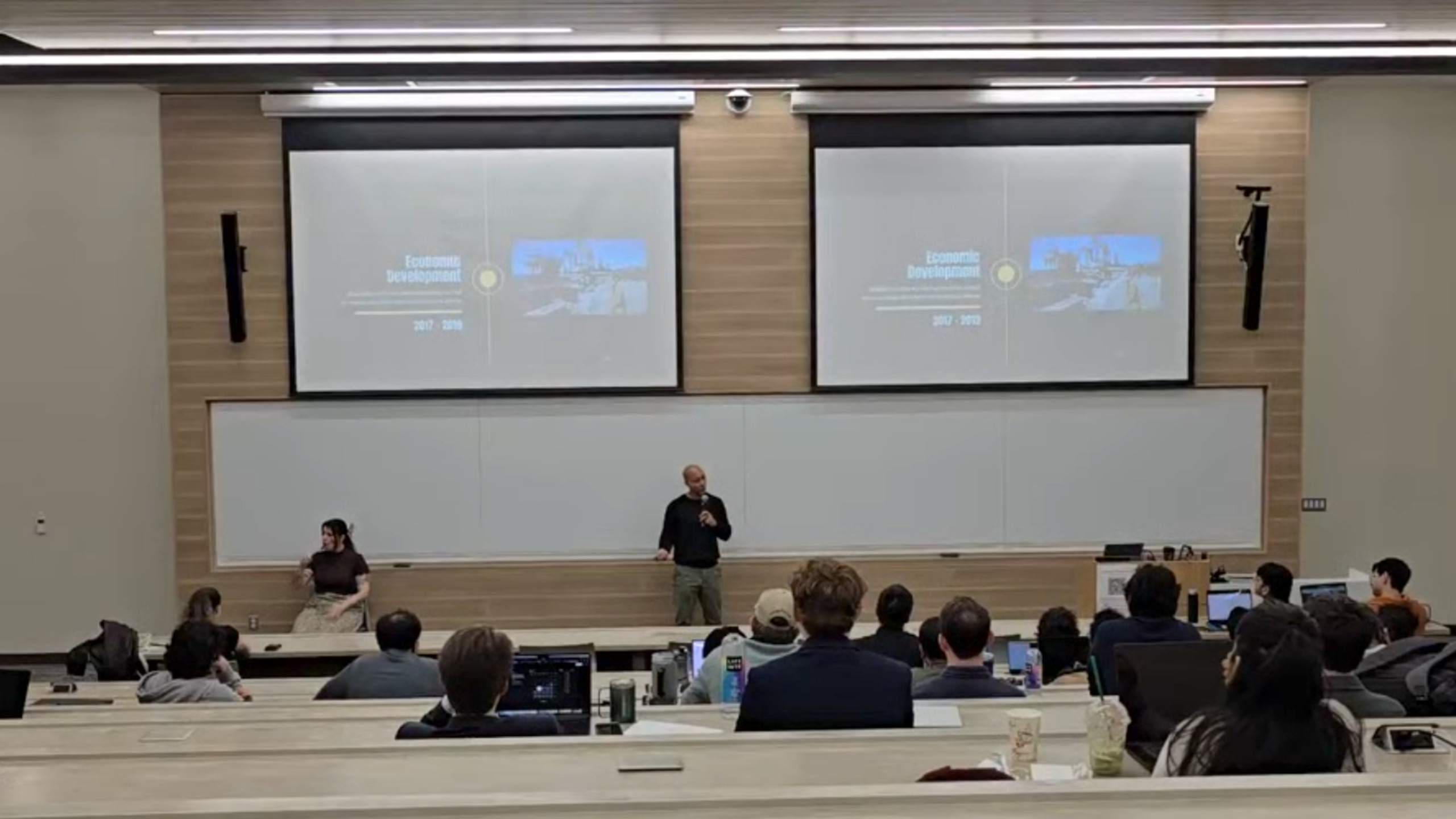
Through VPB Academy, I want students to see themselves as people who can help build the future they are preparing to enter.
We need people who understand technology and care about its effect on everyday life. People who can see a possibility, work with others, and stay with an idea long enough to make it useful.
You don’t have to have your whole career figured out today. Take your education seriously. Get to know yourself through real experiences. Find something worth contributing to.
Your future will take shape through what you learn, what you try, and the people you help along the way.
Bring the VPB Academy Campus Experience to your campus →